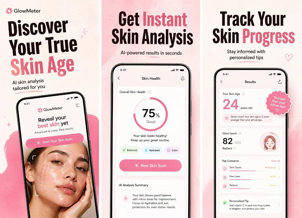
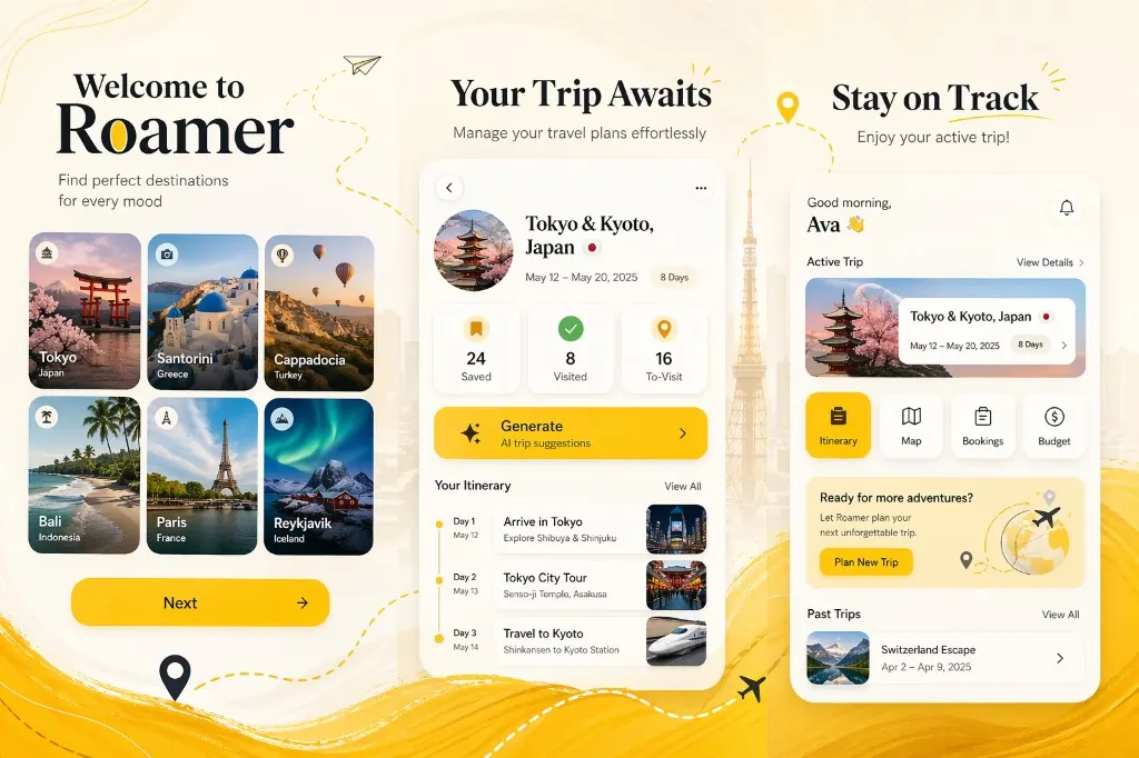
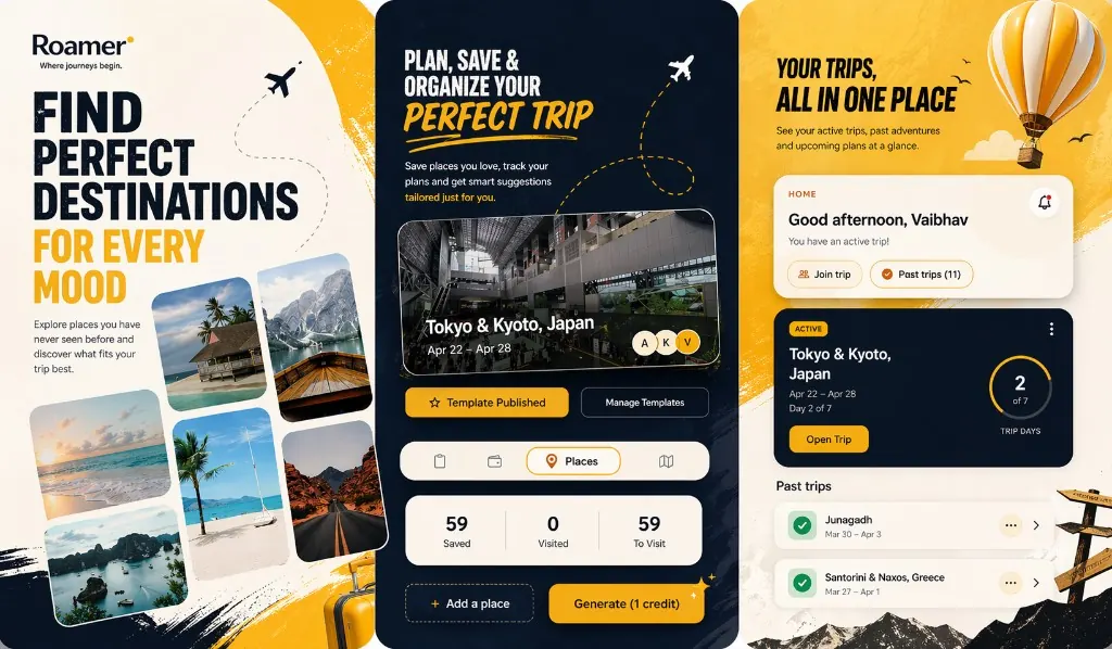
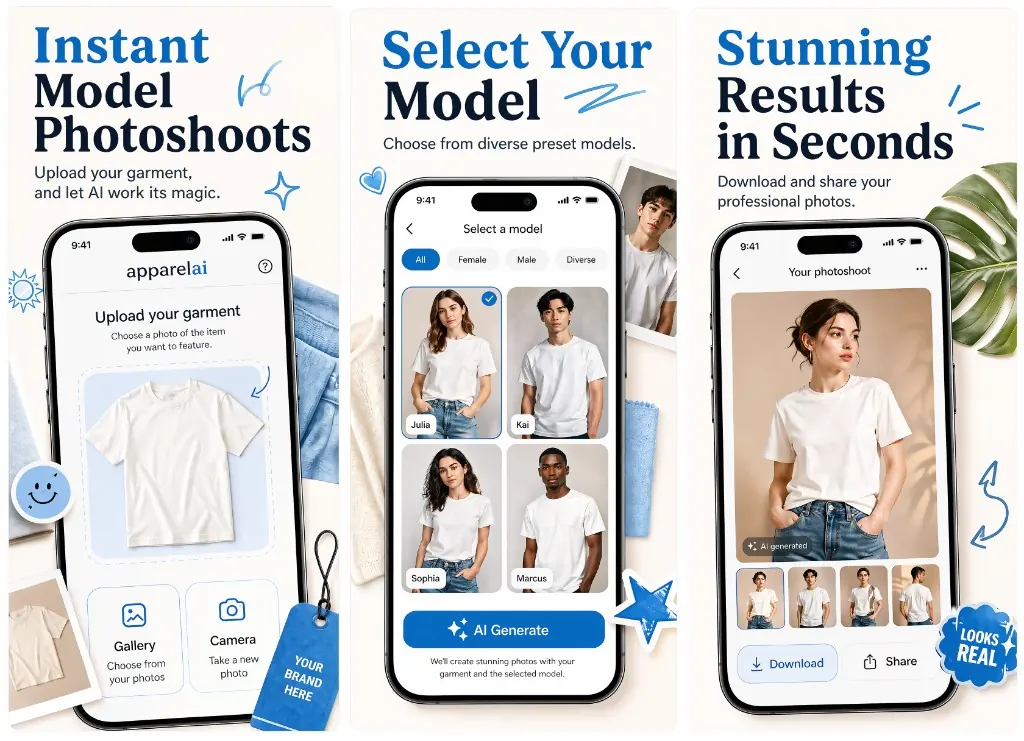
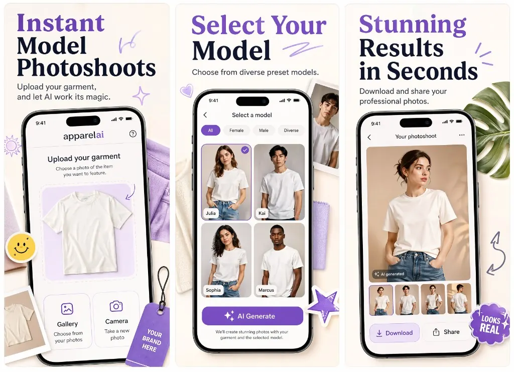
First 3 App Store Screenshots: what each frame should do.
The first three App Store screenshots should not be random product panels. They should hook the user's search intent, prove the core workflow, and remove the doubt that stops someone from installing.
Your first screenshot should explain the outcome, your second should prove the workflow, and your third should answer the user's biggest reason not to install.
That order works because App Store visitors scan quickly. They compare your listing against nearby apps, then decide whether the screenshot story matches what they searched for.
The three-frame framework
Give each screenshot one clear job.
The best first-three sequence feels like a tiny sales page: one hook, one proof point, one confidence builder.
Screenshot 1
Hook the search intent
The first frame should answer the phrase that brought the user to the listing. If the keyword is about habit tracking, budgeting, meditation, invoices, or photo cleanup, the headline should make that outcome obvious before the user reads anything else.
Name the main outcome in 4-7 words
Use the clearest screen, not the prettiest screen
Avoid brand slogans that only make sense after install
Screenshot 2
Prove the core workflow
The second frame should show how the app actually delivers the promise. This is where users decide whether the app feels simple, credible, and different from the next listing in the same search result.
Show one real workflow or feature
Make the UI state easy to understand at thumbnail size
Use copy that explains the action, not a vague benefit
Screenshot 3
Remove the install doubt
The third frame should answer the user's next objection: is it accurate, private, fast, personalized, collaborative, or useful every day? This is the frame that turns curiosity into confidence.
Address trust, speed, personalization, or proof
Keep the story connected to screenshots one and two
Give users a reason to tap through or install
Common mistakes
What weak first-three screenshot sets get wrong.
Most low-performing sets are not ugly. They are unclear. They make users decode the product instead of giving them a reason to install.
Mistake 01
Starting with a feature tour
A feature list makes users work too hard. The first screenshot should make the reason to care obvious before listing mechanics.
Mistake 02
Using the same headline style on every frame
If every panel says the same kind of thing, the set has no story. Frame one should hook, frame two should prove, and frame three should reduce doubt.
Mistake 03
Writing copy that ignores keywords
Screenshot copy does not directly rank like metadata, but it should match the intent behind the search. That continuity helps users feel they found the right app.
Mistake 04
Designing only for the product page
The first three screenshots also appear in App Store search previews. If they only work at full size, they are too complex.
Category examples
The same framework changes by app category.
A finance app needs trust faster. A fitness app needs an outcome faster. An AI app needs proof that the output is actually useful.
Productivity apps
Frame 1
Lead with the time saved or workflow simplified.
Frame 2
Show the main task flow, such as capture, organize, plan, or export.
Frame 3
Prove reliability with sync, reminders, collaboration, or automation.
Fitness and health apps
Frame 1
Lead with the user outcome, not the dashboard.
Frame 2
Show the habit, plan, coach, or daily action.
Frame 3
Build confidence with progress, personalization, or safety cues.
Finance apps
Frame 1
Lead with control, clarity, or money saved.
Frame 2
Show the core financial view in a clean, trustworthy way.
Frame 3
Reduce doubt with security, alerts, automation, or reporting.
AI apps
Frame 1
Lead with the useful output, not 'AI-powered'.
Frame 2
Show the input-to-output workflow.
Frame 3
Prove quality with examples, editing controls, or privacy framing.
AppGrowKit workflow
Turn ASO research into the screenshot story.
AppGrowKit connects keyword intent, competitor context, listing goals, and raw app screens before generating screenshot direction. The output is not just a frame set; it is a first-three story for the search result page.
Add the keywords, category, and positioning goal you care about.
03
Review the first-three screenshot direction.
04
Export iPhone and iPad final screenshots.
FAQ
Quick answers about first-three screenshot strategy.
Why do the first three App Store screenshots matter most?
The first three screenshots are the frames users are most likely to see before deciding whether to open the listing, swipe, or install. They should carry the main search intent, product proof, and install confidence.
Should the first screenshot show the app UI or a benefit headline?
It should usually show both: a real product screen plus one short benefit headline. A pure UI screenshot can be unclear, while a pure marketing panel can feel untrustworthy.
How long should App Store screenshot headlines be?
Aim for four to seven words. Short headlines survive thumbnail previews and localization better than long sentences.
Can AppGrowKit generate the first three screenshot story?
Yes. AppGrowKit uses app screens, keywords, competitor context, and listing goals to create an ASO-powered screenshot direction before exporting final iPhone and iPad assets.
Build the first-three story
Generate ASO-powered screenshots for your app.
Start from your app screens, keywords, and listing goals. Free to start with 10 screenshot credits.