iPhone Mockup Creator: High-Converting App Store Assets
Learn to use an iPhone mockup creator to design high-converting App Store screenshots. This guide covers ASO-driven design, text, and localization.
On this page
- Why Your App Screenshots Need a Strategy
- Screenshots sell before your product does
- Framing adds credibility, but strategy does the heavy lifting
- Find Your App's Most Marketable Moments
- Start with the one screen that explains the app fastest
- Build around contrast not completeness
- Choose a Creative Direction That Fits Your Brand
- Creative Direction Use Cases
- How to decide without overthinking it
- Infuse Your Mockups with ASO Power
- Write headlines that carry search intent and user value
- Order your screenshot slots like a landing page
- Export and Localize for a Global Audience
- Get the export details right
- Localization changes the economics of your listing
- Your High-Conversion Mockup Checklist
- Check the first impression
- Check the sequence and copy
- Check production quality before submission
You've shipped the build, fixed the crashes, and finally reached the App Store listing. Then the screenshot task lands on your desk and it feels deceptively simple. Drop a few screens into an iphone mockup creator, add a gradient background, export, done.
That's the mistake.
Your screenshots aren't just proof that the app exists. They're sales assets. According to industry benchmarks from 2023-2025 collected by ScreenshotWhale, app screenshots directly influence 70-80% of download decisions, with professionally framed mockups increasing conversion rates by up to 32% compared to plain UI captures. If you treat them like a design chore, you'll likely publish a listing that looks finished but doesn't convert.
Why Your App Screenshots Need a Strategy#
Most weak listings fail in a predictable way. The team shows too much, says too little, and uses screenshots as documentation instead of persuasion.
A raw product capture tells users what the interface looks like. A strong mockup tells them why the app matters. That difference is what separates “nice UI” from “I want this.”
Screenshots sell before your product does#
When someone lands on your listing, they don't read it like a spec sheet. They scan. They judge visual polish, clarity, relevance, and trust in a few seconds. That's why an iphone mockup creator matters, but only if you use it as a storytelling tool instead of a framing tool.
A budgeting app shouldn't lead with a settings screen just because it looks tidy. A meditation app shouldn't open with a long feature list if the calmer, more persuasive move is showing the first guided session. A delivery app shouldn't waste slot one on account setup when hungry users care about speed, availability, and checkout simplicity.
Practical rule: Your first screenshot should answer one question fast. “Why should I download this instead of the other app next to it?”
Framing adds credibility, but strategy does the heavy lifting#
Device framing helps because it places your UI in a familiar context. It looks more finished than a flat crop, and it can guide attention when paired with strong text and layout choices. But the frame itself isn't the win.
What works is the combination of:
- A strong opening claim that names the app's core benefit
- A screen choice with marketing value instead of internal logic
- A visual style that fits the category so the app feels native to its market
- A sequence that builds desire from first glance to final screenshot
Teams often obsess over shadows, gradients, and phone angles while ignoring the bigger issue. They haven't decided what story the set needs to tell.
That's why “just making screenshots” usually produces average results. Strategy forces harder choices. Which feature deserves slot one? Which screen proves your differentiation? Which visual should create confidence for someone who's never heard of your brand?
Get those decisions right first. The mockup creator becomes useful after that.
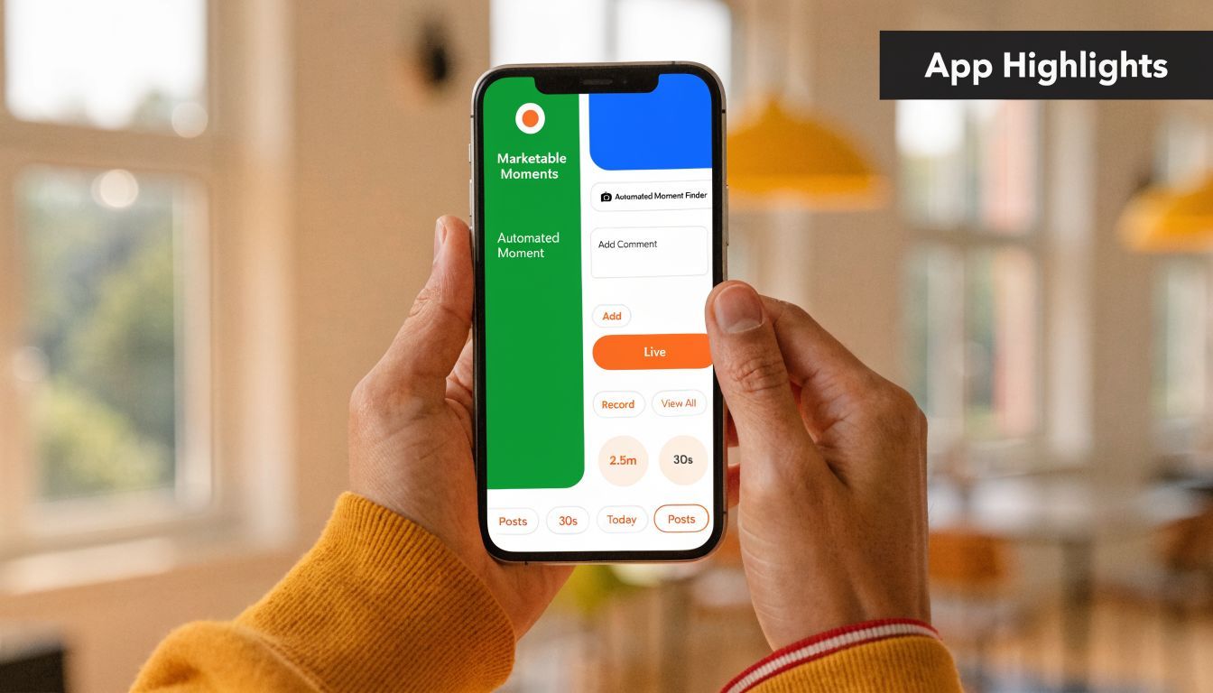
Find Your App's Most Marketable Moments#
The best screenshot sets don't walk through the app. They isolate the moments that make a user think, “That solves my problem.”
That sounds obvious, but designers still choose screens based on product structure. They follow the tab bar, start at onboarding, and end at profile settings. That approach feels organized inside the company and lands flat in the store.
A better approach starts inside the product and asks which moments carry the most commercial weight. That gap is common. A 2025 State of ASO reference discussed by iMockup Pro says 72% of indie developers report using manual trial-and-error for screenshot compositions, which is exactly why so many listings look polished but generic.
Start with the one screen that explains the app fastest#
Every app has an “aha” screen. It may not be your prettiest screen, but it's usually the one that makes the product click.
For a habit tracker, that might be the streak view with a clear completion signal. For a language app, it might be the speaking exercise where the user sees instant feedback. For a fitness app, it might be the personalized workout plan, not the dashboard.
Use this quick filter:
- Would a new user understand the value in under three seconds?
- Does the screen show an outcome, not just a feature?
- Would this still make sense if the caption disappeared?
If the answer is no, it probably belongs later in the set or not at all.
Build around contrast not completeness#
A high-converting set usually includes three distinct roles, not six variations of the same interface:
- Core value moment: the fastest explanation of what the app does
- Differentiator moment: the screen that competitors would struggle to claim
- Proof or progress moment: something that shows completion, personalization, momentum, or trust
A finance app could pair a clear spending overview with a goal-tracking screen and then a bill reminder that shows control. A recipe app could pair meal planning, one-tap grocery building, and a finished weekly plan.
Don't ask, “What screens should we include?” Ask, “What evidence would convince someone this app is worth downloading?”
That shift improves everything that follows, from copy to slot order to creative style.
If you want a useful benchmark for how real listings structure these moments, study app store screenshot examples across categories. Not to copy layouts one-for-one, but to notice how winning sets simplify the story.
Choose a Creative Direction That Fits Your Brand#
Once the screen choices are solid, presentation starts to matter. Many teams reach for a template too early at this stage and accidentally force the app into the wrong visual language.
A tax app shouldn't look like a mobile game. A social app usually suffers when it's presented like enterprise software. The right iphone mockup creator helps, but the category fit still depends on your judgment.
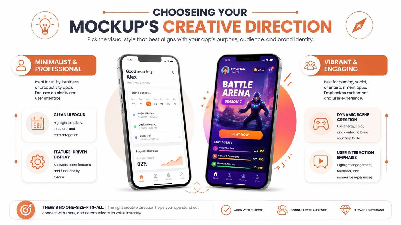
There isn't one winning style. There are trade-offs. A/B testing data referenced by Guarana Technologies notes that 72% of tech apps opt for a clean mockup direction for an 18% CTR boost, while dynamic stack or editorial poster directions can outperform clean mockups by 19% in emerging markets and entertainment categories.
Creative Direction Use Cases#
| Direction | Best For | Brand Feel | Example App Category |
|---|---|---|---|
| Clean Mockup | Utility apps, finance, SaaS companions | Precise, trustworthy, product-first | Budgeting, scheduling, productivity |
| Editorial Poster | Lifestyle, wellness, media | Premium, expressive, campaign-like | Meditation, fashion, publishing |
| Connected Story | Multi-step workflows | Guided, logical, narrative | Project management, meal planning, travel |
| Dynamic Stack | Entertainment, gaming, social | Energetic, layered, high-motion | Casual games, creator tools, chat apps |
How to decide without overthinking it#
If your app wins on clarity and trust, choose clean mockup. This style gives the UI room to work. It's strong when your differentiator is practical, such as faster booking, easier invoicing, or better budgeting.
If your app sells a feeling as much as a function, editorial poster often works better. It lets typography, mood, and spacing carry more emotion. That's useful for wellness, self-improvement, travel, and media products.
Connected story is underrated. It works when the app's value only becomes obvious across a sequence. Think meal planning from browse to plan to shop, or a team app that moves from task creation to assignment to completion. This style can make a complex workflow feel intuitive.
Dynamic stack is riskier. It grabs attention, but it can also reduce clarity if your screens are already busy. I'd use it when visual energy is part of the product promise, such as gaming, social creation, or entertainment browsing.
A style should amplify your app's strongest trait. If it competes with the UI for attention, it's the wrong style.
One more practical trade-off. Teams often pick a direction based on what looks impressive in a portfolio. App Store performance is less forgiving. Use the style that makes the value proposition easier to understand, not the one that gets the most compliments from other designers.
Infuse Your Mockups with ASO Power#
A good-looking screenshot set can still underperform because the text is vague, generic, or disconnected from how users search. Mockup design and ASO stop being separate tasks at this intersection.
The visual tells users what they're seeing. The caption tells them why it matters. If those two aren't aligned, the listing feels polished but unconvincing. That's also where many teams lose visibility. Benchmarks discussed in this AI mockup workflow article show that ignoring keyword density and relevance in screenshot captions can drop an app's search visibility by up to 40%.
Write headlines that carry search intent and user value#
Weak screenshot copy describes the screen:
- Dashboard Overview
- Smart Reports
- Better Tracking
Better screenshot copy translates the feature into a user result:
- Track every expense in one view
- Build reports without manual work
- Stay on top of your habits daily
Notice the difference. The second set gives users a reason to care.
A few practical rules help:
- Lead with the benefit: Start with what improves for the user
- Use plain language: Store visitors don't reward clever phrasing if it hides meaning
- Bring in relevant terms naturally: If people search for budget planner, meal planner, habit tracker, invoice maker, or workout app, your captions should reflect that language where it fits
- Keep each slot focused: One message per screenshot is almost always stronger than a headline plus three subclaims
If you need a framework for tying screenshot copy back to listing strategy, this app store optimization checklist is a useful reference point.
Order your screenshot slots like a landing page#
Most teams know the first screenshot matters. Fewer teams think carefully about slot two, three, and four. That's where the narrative either compounds or falls apart.
A practical sequence often looks like this:
- Primary value proposition
Show the screen that explains the app fastest, paired with the clearest benefit statement. - Differentiator
Introduce the feature or flow that makes your app feel stronger than alternatives. - Ease or speed
Reduce friction. Show how simple the core task feels inside the app.
Before placing later screenshots, it helps to look at how motion and sequencing affect persuasion in real creative workflows.
- Trust or progress
Show outcomes, personalization, streaks, saved time, or successful completion. - Expanded use case
Introduce breadth without losing focus. - Closing reinforcement
End with a screen that leaves the product feeling complete and credible.
A meal planning app might move from “Plan weekly meals fast” to “Auto-build your grocery list” to “Cook with step-by-step recipes” to “Stay consistent all week.” A finance app might move from “See all spending instantly” to “Create budgets that hold” to “Never miss a bill” to “Reach savings goals with less effort.”
The best screenshot order doesn't mirror the app's navigation. It mirrors the user's decision process.
Export and Localize for a Global Audience#
A lot of screenshot work gets wasted at the finish line. The story is right, the design is clean, and then the exported assets are inconsistent, blurry, oversized, or not adapted for key markets.
That's where operational discipline matters. An iphone mockup creator should help you produce store-ready files, but you still need to think about output quality and localization as part of growth, not just production.
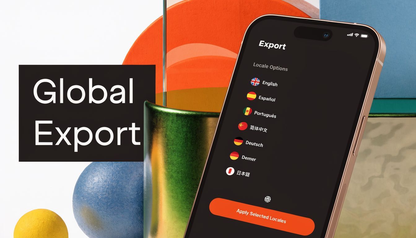
Get the export details right#
For current iPhone portrait sets, 1290×2796 is a key store-ready export size referenced in the verified dataset around modern iPhone mockup workflows. Use PNG when interface sharpness matters most, especially for text-heavy screens. Use JPG when file weight and photographic backgrounds matter more.
A few practical checks prevent last-minute issues:
- Check text legibility at mobile viewing size: Large desktop previews can hide weak hierarchy
- Keep safe spacing around top and bottom UI zones: Framed mockups can make tight compositions feel cramped
- Match colors carefully: iPhone-focused assets benefit from display-accurate color handling, especially when gradients and brand tones do heavy visual work
- Export consistent sets: Device style, text positioning, and spacing should feel systematic across all slots
Teams that skip this stage often blame poor conversion on creative direction when the underlying issue is execution drift.
Localization changes the economics of your listing#
English-only assets leave money on the table in markets where users expect localized messaging. It's not just about translating text. Good localization adapts phrasing, feature emphasis, and sometimes even screenshot order.
That opportunity is getting harder to ignore. Data.ai's State of Mobile 2026 figures cited here say iOS localization downloads surged 28% YoY, yet 81% of indie developers lack localized assets, which means many teams still ship one screenshot set and hope it travels.
That usually doesn't work well. A budgeting app in one market may need to emphasize control and bill organization. In another, it may need to stress savings goals or family spending. A food app may win with speed in one language set and with discovery or discounts in another.
For teams expanding internationally, localized App Store screenshots are less a design upgrade and more a distribution requirement.
Localized screenshots shouldn't be a translation layer added at the end. They should be part of the creative workflow from the first approved set.
Your High-Conversion Mockup Checklist#
Before you upload anything, audit the set like a growth asset, not a design file. The point isn't whether the mockups look attractive in isolation. The point is whether they help a stranger understand, trust, and want the app.
Check the first impression#
Ask these questions first:
- Does slot one state the app's main value clearly? If a user only sees the first screenshot, they should still understand the offer.
- Does the chosen screen show an outcome? Users respond better to progress, clarity, speed, and results than to navigation chrome.
- Does the visual style fit the category? Utility apps need a different treatment than entertainment apps.
If any answer feels uncertain, rework the opening before touching later slots.
Check the sequence and copy#
Review the rest of the set as a narrative:
- Does each screenshot carry one job? Don't let one image explain three unrelated ideas.
- Do the captions sound like user value, not internal feature labels?
- Does the order build confidence? Lead with value, then differentiation, then ease, then proof.
A common failure pattern is repetition. Different screens, same message. That wastes your best real estate.
Check production quality before submission#
Use a final operational pass:
- Are all exports store-ready and consistent? Resolution, spacing, and file quality should match across the set.
- Are your localized variants reviewed by someone who understands the market language? Literal translation often weakens the message.
- Do the mockups still look good on an actual phone screen? Zoomed-out mobile viewing catches hierarchy problems quickly.
If a screenshot can't explain itself without a verbal pitch from your team, it isn't ready yet.
Strong app store assets don't happen because the frame looks expensive. They work because every choice, screen, copy, order, and export, supports the same conversion story.
If you want to turn raw product screens into store-ready assets faster, AppGrowKit is built for that workflow. It helps mobile teams identify marketable moments from real UI, apply the right creative direction, align screenshots with ASO strategy, and export localized App Store sets without the usual manual grind.
Stop reading. Start ranking.
AppGrowKit takes everything in this article and runs it for you: keyword research, live ranks, conversion-focused screenshots, and market intel. Free to start.